Business Problem:
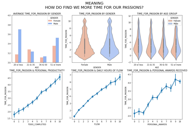
The concept of work-life balance implies that work is bad and life is good; it suggests that work and life are two dichotomous entities that need to be strictly separated and kept at an equilibrium; for some, it even insinuates that less work equals more happiness. In its most neutral definition, work is generally seen as a means for sustenance and survival—laboring the land to harvest food, then later on, as a way to produce goods and offer services in exchange for security. The objective of this notebook is to conduct an Exploratory Data Analysis of the survey responses and advance the understanding of work-life balance and its major influencers are.
Background / History:
A 2019 study by software company ResuceTime looked at 185 million hours of working time. Here are some key findings, Workers average just 2 hours and 48 minutes of productive device time a day. 21% of working hours are spent on entertainment, news, and social media. 28% of workers start their day before 8:30 a.m. (and 5% begin before 7 a.m.). 26% of work is done outside of regular working hours. We check email and instant messaging, on average, every 6 minutes. 40.1% of our day is spent multitasking with communication tools. The most distracted days of 2018 were November 26 and July 7 (the Mondays after Thanksgiving and the 4th of July).
Data Explanation:
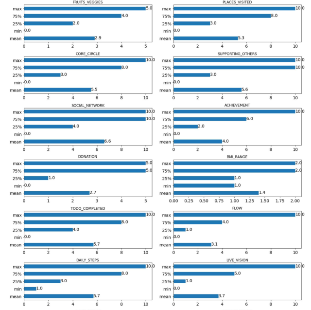
The dataset is a CSV file obtained from the website called “authentic-happiness.com”, containing the following columns for the analysis.
- Timestamp – Timestamp on when the record made
- Daily_stress – daily stress level
- Places_visited – Number of places visited
- Supporting_others – Number of persons supported by him/her.
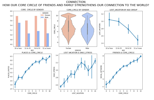
- Social_network – Number of social networks he/she has.
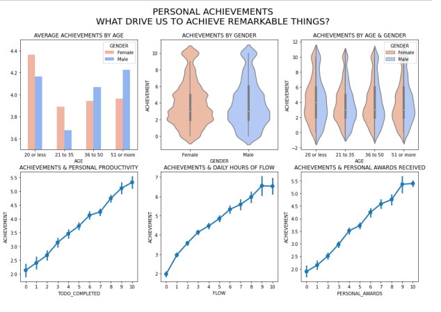
- Achievement – Number of achievements he/she has.
- Donation – Donations made by that person
- BMI_range – BMI level of the person
- Daily_Meditation – How many minutes the person is doing meditation
- Gender – Gender of the person
Methods:
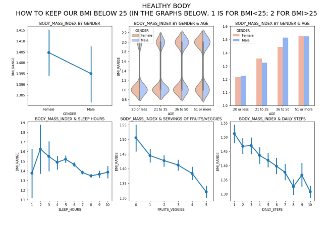
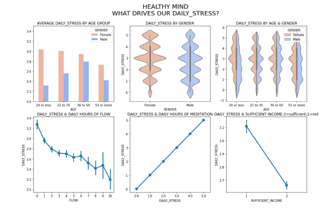
The first step for the project is data import and preparation. For most of the visualizations, we are going to use the seaborn library. Seaborn is a Python data visualization library based on matplotlib. It provides a high-level interface for drawing attractive and informative statistical graphics. We are going to use a point plot to observe the relationship between sleep hours vs BMI range, Daily steps vs BMI range, etc. Also, violin plot to find the relationship between gender and daily stress, age vs daily stress, etc. Based on all the visualization we will come up with conclusions on how the work-life balance is there for a different set of people with different backgrounds and conclude which set of people is having a very good work-life balance.
Analysis:
The work-life balance is the most important part for every corporate employee that has surrounded the world, especially for the past two years due to pandemics. The datasets consist of vital data like stress level, daily workout habits, the total number of hours worked for a set of employees from the survey. Then the distribution of the data was examined using the most up-to-date “authentic-happiness.com” website data and its parameters were obtained according to the statistical distributions.
Conclusion:
As of now, to conclude we haven’t changed any of the methods for the prediction. We will be plotting every data in one or another form to suit the visualization to obtain the results. From the plotting, we will be concluding what is the most parameter impacting the work-life balance of a corporate employee and also what factor makes them happy. From the result, we can suggest corporates enhance the work-life balance of their employees.
Assumption:
Here, we are going to use a dataset from the website called “authentic-happiness.com” which is a famous website to get the work-life balance data. But, the data is a very generic one and the work-life balance may vary for a different set of people because of their culture and environment. Here, we are assuming the culture and environment are the same for all sets of employees and we are removing that factor.
Limitations:
As mentioned early, we are assuming that the culture and environment are the same for all sets of employees and we are removing that factor. Because of the assumption, the result may vary and lead to a less accurate visualization and I feel that is a limitation for this project. We can remove that limitation by implementing the same visualization for a different set of people and collating it all together to get a conclusion.
Challenges:
In this project, we are considering factors like countries, genders, etc and the results may lead to gender-biased or racism. So, keen observations on each step are required so that the result is accurate. The data which we are going to handle for this project is a CSV file and we don’t the exact accuracy of the data. So, we have to measure the accuracy of the data somehow to make the results realistic. Apart from that, I don’t see any challenges in this project.
Future Uses / Additional Applications:
Based on the visualization, we can make the visualization real-time, and also we can add filters to get the result exactly to match the particular set of people. We can deploy the project in a centralized server and get the results in the form of RESTful API to showcase it on different platforms like android, iOS, web, etc. We can give the result to all corporate management to achieve a good work-life balance for their employees.
Recommendations:
As per websites like Kaggle and other data science websites, the recommended library for visualizations is matplotlib and seaborn. Matplotlib is a comprehensive library for creating static, animated, and interactive visualizations in Python. Matplotlib makes easy things easy and hard things possible. Seaborn is a Python data visualization library based on matplotlib. It provides a high-level interface for drawing attractive and informative statistical graphics. Visualization is the central part of Seaborn which helps in the exploration and understanding of data.
Implementation plan:
We can use data from the above-mentioned sites to extract the data for the analysis. Then will create lots of visualizations to show the parameters affecting work-life balances. Then we will implement the same visualization for a different set of employees by using different datasets. Based on the visualizations, we can publish the results somewhere on the server.
Ethical Assessment:
In this project, we are going to use the data which is available for public use from websites. So, there are no ethical issues in handling data. But the ethical issue might raise when we release the results of this project because it’s experimental and we don’t know exactly how far the visualization is correct. So, there are some potential threats that the result may mislead the people about their work-life balance and corporate to take decisions on them and employees respectively. Thus, to avoid this kind of issue, we need to test the visualizations thoroughly with all possible parameters.
References:
- Work-Life Balance Survey EDA | Kaggle
- The problem with work-life balance: it’s actually a rollercoaster – Ness Labs
EDA:
Healthy Body:
Healthy Mind:
Expertise:
Connection:
Passion:
